Milk Pastels
Published:

Template User Rights
Report Card Samples
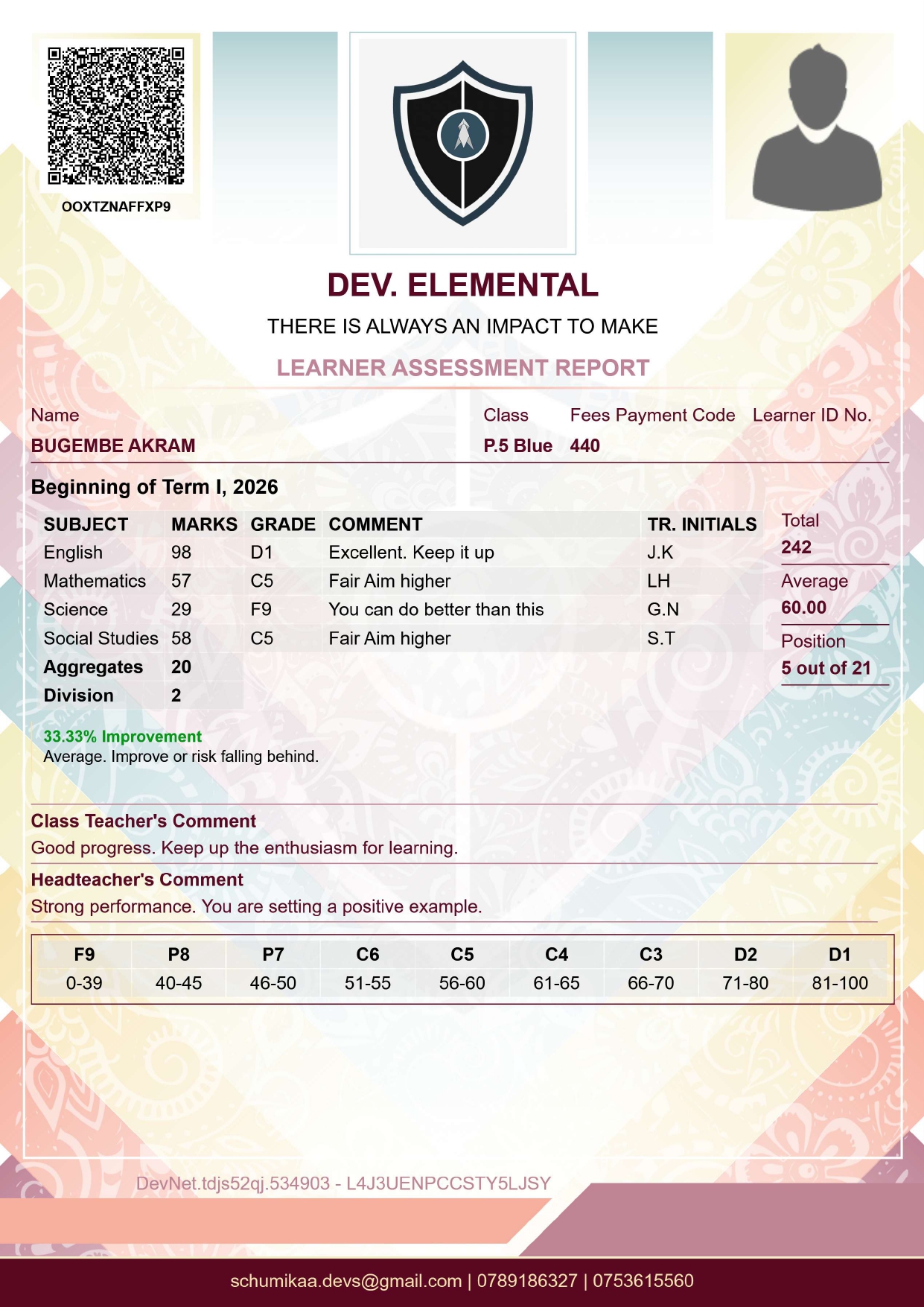
Milk Pastels - The Tenderness of Memory
Milk Pastels is a palette built around emotional softness, intimacy, and quiet nostalgia. Milk Pastels speaks in whispers, warmth, and remembrance. It draws people in through emotional gentleness. The design feels like old family albums, handwritten letters, warm daylight through linen curtains, faded ink, soft tones, quiet afternoons, moments remembered more by feeling than detail.
This is a palette of emotional atmosphere.
Core Emotional Identity
Milk Pastels is driven by five emotional principles.
1. Tenderness
The palette immediately communicates emotional safety. Its soft creams, muted pinks, dusty peaches, warm beige tones, and faded neutrals create an environment that feels caring, human, approachable, emotionally calm. Nothing in the design shouts - everything feels gently placed.
This softness creates the impression that the document was designed with emotional consideration rather than institutional rigidity.
2. Nostalgia
One of the strongest characteristics of Milk Pastels is its memory-like quality. The colors resemble;
- Slightly faded photographs
- Old stationery
- Aged paper
- Washed fabric
- Sun-softened interiors
The muted tones mimic how memories lose sharpness over time while retaining emotional warmth. This gives the design a deeply reflective atmosphere. It feels less like "Here are your results." and more like "Here is a moment worth keeping."
3. Quiet Romance
The palette contains emotional warmth without becoming ornamental or overtly feminine. Its romanticism is subtle warm blush tones, soft cream light, delicate contrast, restrained warmth. It evokes;
- Handwritten Notes
- Pressed flowers inside books
- Soft Conversations
- Emotional Sincerity
This is not luxury romance - it is intimate emotional realism.
4. Human Warmth
Milk Pastels feels profoundly human because its colors resemble natural warmth;
- Warm Milk
- Peach Light
- Parchment
- Cotton Fabric
- Candlelit Cream Interiors
This organic softness removes the coldness often associated with institutional documents. The learner feels seen as a person, not merely as data.
5. Emotional Reflection
Unlike bold academic templates that celebrate achievement through authority and rigidity, Milk Pastels encourages reflection. It creates space for;
- Emotional Connection
- Personal Growth
- Quiet Encouragement
- Thoughtful Observation
The report begins to feel almost diary-like - personal, sincere, emotionally aware.
Design Language Breakdown
Cream and Milk Whites: These tones establish softness and openness. Unlike stark white, milk-toned backgrounds feel warmer, safer, less clinical, more intimate. They resemble textured paper, watercolor stock, handwritten journals, old stationery. This creates emotional accessibility.
Dusty Pink and Muted Peach: These colors introduce warmth without intensity. They symbolize affection, care, emotional sincerity, gentleness, human closeness. Because the tones are muted rather than saturated, the design avoids looking playful or childish. Instead, it feels mature and emotionally intelligent.
Warm Beige and Faded Taupe: These grounding colors add memory, age, softness, calm stability. They evoke linen, old paper, wooden interiors, warm dust in afternoon light. These shades are essential for the nostalgic quality of the palette.
Soft Gray Undertones: The subtle grays prevent the palette from becoming overly sweet. They introduce quietness, restraint, introspection, emotional balance. This is why the template feels reflective instead of decorative.
Symbolic Inspiration
Milk Pastels draws inspiration from emotional and sensory experiences more than from institutions or heraldry. Its symbolic influences include;
- Handwritten Journals
- Vintage Postcards
- Memory Boxes
- Soft Portrait Photography
- Afternoon Sunlight
- Faded Letters
- Family Keepsakes
- Delicate Watercolor Illustrations
The palette feels deeply analog - it resists digital sharpness.
Cinematic and Artistic Atmosphere
Milk Pastels resembles;
- A quiet reading room
- S softly lit bedroom
- A sunlit café corner
- An artist’s journal
- A nostalgic film
Its atmosphere aligns with;
- Intimate Cinema
- Memory-Driven Storytelling
- Reflective Photography
- Emotionally Warm Illustration
The design feels lived-in rather than constructed.
Psychological Effect on Viewers
On Parents: The report feels caring, emotionally considerate, personal, gentle.
It suggests that the institution values the learner as a human being rather than only measuring performance.
On Learners: Milk Pastels can reduce emotional pressure because the palette does not feel punitive or rigid. It encourages;
- Self-reflection
- Emotional Comfort
- Quiet Motivation
Even criticism feels softer within this atmosphere.
On Institutions: An institution using this palette appears;
- Nurturing
- Emotionally Intelligent
- Modern - In a human-centered way
- Thoughtful
It communicates care through restraint.
Why "Milk Pastels"?
The name succeeds because it combines two emotional ideas - Milk - which symbolizes warmth, nourishment, softness, comfort, gentleness, purity - and Pastels - which symbolizes faded emotion, calmness, delicacy, artistic softness, emotional subtlety. Together, the name suggests softened emotion preserved in light.
It sounds warm, artistic, nostalgic, delicate, emotionally calm.
Overall Essence
If Milk Pastels was transformed into a physical environment, it would resemble A softly sunlit room with cream curtains moving gently in afternoon air, handwritten notes resting on a warm wooden surface, faded photographs nearby, and the quiet emotional atmosphere of cherished memory.
Milk Pastels is therefore not simply a soft palette - it is;
- Emotional Gentleness
- Nostalgia - made visual
- Quiet Reflection
- Human Warmth
- Memory - Softened by time
Milk Pastels is a palette built around emotional softness, intimacy, and quiet nostalgia. It speaks in whispers, warmth, and remembrance. It draws people in through emotional gentleness.
The design feels like old family albums, handwritten letters, warm daylight through linen curtains, faded ink, soft tones, quiet afternoons, moments remembered more by feeling than detail.