The Shire
Published:
Template User Rights
Report Card Samples
The Shire - The Warmth of Learning
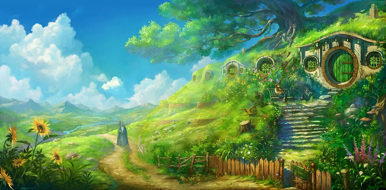
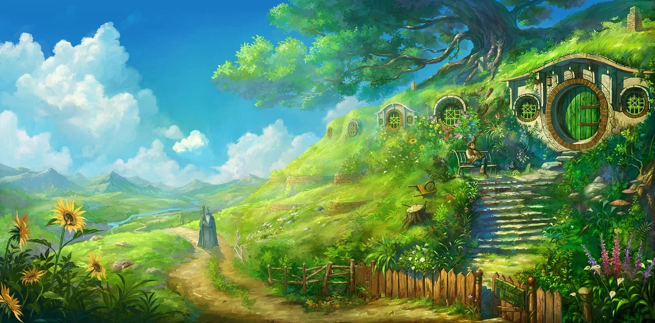
The Shire is a design built around warmth, grounded simplicity, quiet encouragement, and the feeling of belonging. Unlike highly ceremonial academic templates that emphasize institutional authority, The Shire approaches education as something deeply human, familiar, and nurturing. The design does not feel distant from the learner. It feels close, calm, approachable, and lived in.
The template speaks through softness and stability. Its atmosphere resembles countryside calm, handwritten school records, homely classrooms, gentle mentorship, quiet academic growth, personal encouragement, natural simplicity. The design feels less like an institutional performance sheet and more like a learner’s educational journey being carefully documented by people who genuinely know them.
There is something deeply grounded about it. The structure remains organized and academic, but the emotional tone is softened by earthy colors, open spacing, restrained decoration, and natural visual warmth. The Shire feels educational without becoming intimidating - it feels human before it feels administrative.
Core Design Character
The Shire is shaped by six emotional and visual principles.
1. Grounded Warmth
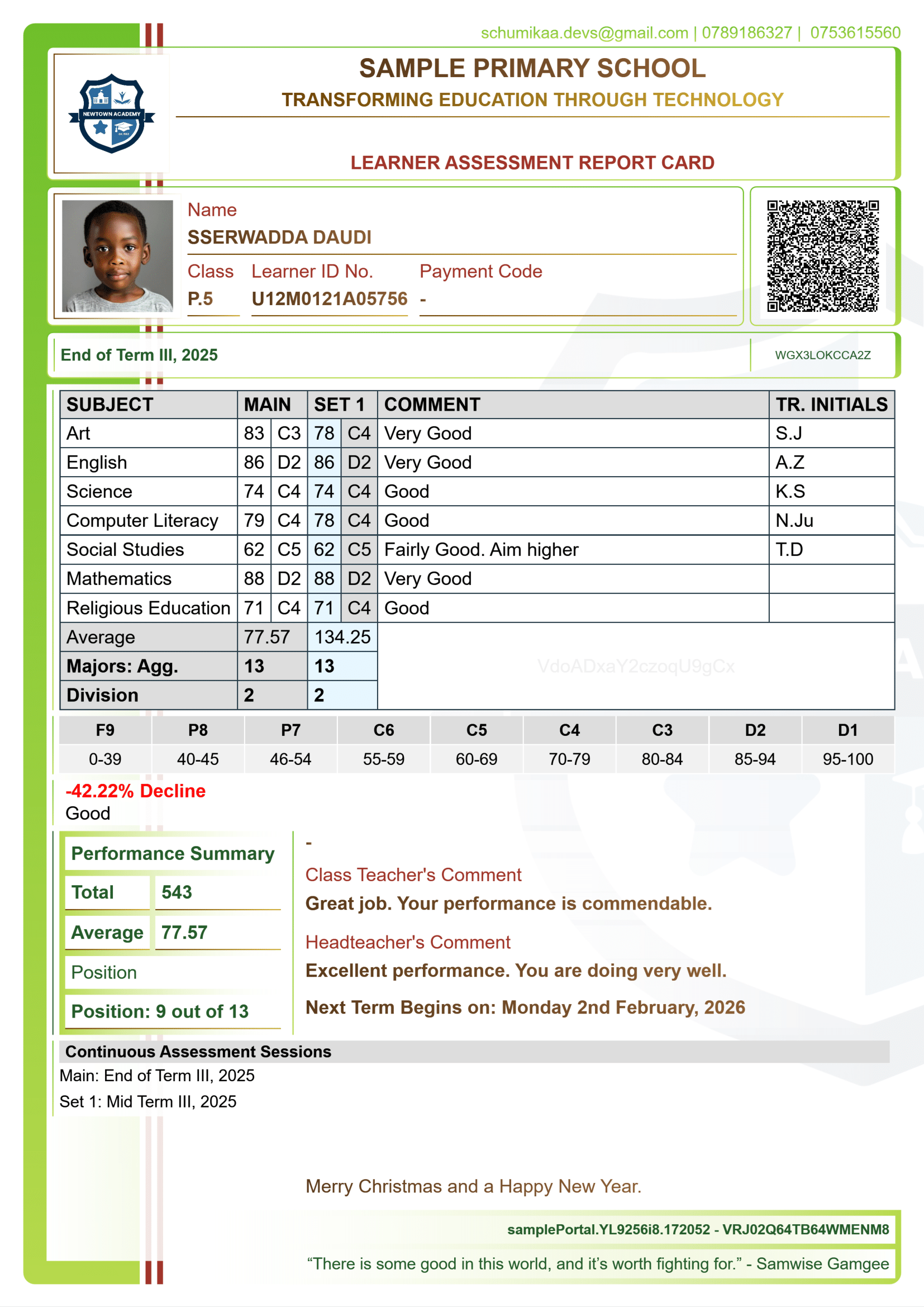
The strongest emotional quality of The Shire is warmth. The olive greens, soft browns, muted golds, pale grays, and light cream tones create a palette that feels natural and emotionally safe. The colors resemble moss-covered stone, parchment paper, wood interiors, soft daylight, countryside fields, aged books, classroom chalk dust.
This creates immediate emotional familiarity. The learner does not feel judged by the document - they feel held within it. The warmth softens the psychological pressure often associated with academic reporting systems.
2. Quiet Encouragement
The Shire avoids visual aggression - nothing shouts for attention. Even important information like performance metrics, comments, summaries is integrated gently into the design rather than dramatically elevated. This creates a feeling of calm educational guidance rather than institutional pressure. The design says "keep growing", "keep learning", "improvement matters", "progress is personal"
The atmosphere encourages learners rather than confronting them. This emotional restraint is central to the character of the template.
3. Natural Simplicity
The design language of The Shire is intentionally modest.
- The borders are thin
- The spacing breathes
- The decorative elements are restrained
- The typography feels practical rather than ornamental
This simplicity creates honesty. Nothing in the template feels performative or excessively polished. Instead, it resembles school records carefully maintained over time, handwritten educational archives, humble institutional stationery, trusted local schooling systems. The design feels authentic rather than corporate.
4. Human-Centered Structure
Although organized academically, The Shire prioritizes readability and emotional comfort over rigid institutional geometry. The sections flow naturally - the eye moves through the page gently rather than mechanically. The structure feels supportive which makes the document psychologically accessible, especially for younger learners and parents who may feel overwhelmed by overly formal academic systems.
5. Countryside Academic Aesthetic
The emotional atmosphere of The Shire resembles a rural or community-centered educational environment where learning is personal and relational rather than industrial.
The template evokes village schools, green school compounds, quiet libraries, old educational booklets, teachers who know learners personally. There is an earthy calmness throughout the design - even the green framing feels organic rather than decorative. The report feels rooted.
6. Gentle Institutional Identity
The Shire still maintains educational credibility, but it expresses authority softly. Unlike highly formal templates that emphasize hierarchy and prestige, this design communicates care, reliability, consistency, educational sincerity. The institution appears nurturing rather than imposing which creates trust through warmth instead of rigidity.
Design Language Breakdown
Earthy Green Framework: The green framing is the emotional anchor of the entire design. The tones resemble countryside vegetation, olive branches, natural growth, school gardens, renewal, steady development. Green symbolizes learning here not as competition, but as cultivation, therefore the learner appears to be growing rather than being measured. This distinction changes the emotional experience of the report significantly.
Soft Browns and Warm Golds: The warm brown typography introduces stability, maturity, grounded intelligence, familiarity. These tones resemble wooden desks, aged educational paper, ink on parchment, old school signage. The warmth prevents the template from feeling digitally cold - it feels tactile and human.
Pale Gray Background Softness: The muted gray foundation softens the contrast throughout the document. Unlike bright white, the gray tones feel quieter, gentler, calmer, more relaxed visually. This reduces visual tension and allows the content to breathe comfortably. The document becomes easier to engage with.
Thin Structural Borders: The borders organize the report without dominating it. They provide clarity, structure, readability, segmentation while remaining visually lightweight. This balance is essential to the design’s calm personality - the structure supports rather than controls.
Minimal Decorative Language: The Shire avoids heavy ornamentation -its visual identity comes from spacing, tone, color harmony, natural balance rather than dramatic graphics or layered visual effects. This restraint creates timelessness - the design feels enduring because it does not depend on trends.
Symbolic Inspiration
The Shire draws inspiration from educational warmth, community-centered learning, and natural simplicity rather than institutional prestige. Its symbolic influences include countryside schools, handwritten learner journals, village learning environments, old educational records, library books, natural landscapes, community noticeboards, quiet academic mentorship.
The design values human connection over performance spectacle.
Atmospheric Identity
The Shire feels like a;
Calm classroom in the afternoon
Rural learning environment
Teacher’s carefully kept learner records
School grounded in community values
Peaceful educational journey
Its atmosphere aligns with educational warmth, grounded learning, quiet encouragement, personal growth, nurturing structure. The template feels emotionally safe.
Psychological Effect
On Parents: Parents experience emotional reassurance, warmth, educational sincerity, trust through simplicity. The school appears caring, attentive, and learner-centered.
On Learners: Learners feel encouraged rather than pressured, recognized personally, emotionally comfortable, gently guided. Even performance criticism feels constructive within this atmosphere.
On Institutions: An institution using The Shire appears nurturing, community-oriented, grounded, emotionally intelligent, educationally sincere. The institution communicates care through calmness.
Why "The Shire"?
The name succeeds because it evokes simplicity, belonging, peacefulness, grounded life, warmth, community - a shire is not grand or imperial - it is familiar, lived in, human-scaled, comfortable.
The name perfectly reflects the emotional atmosphere of the template.
Overall Essence
If The Shire became a physical environment, it would resemble A quiet countryside school surrounded by greenery - sunlight falling softly through classroom windows, wooden desks worn gently by years of learning, teachers speaking calmly with learners, carefully maintained report books resting on shelves, and an atmosphere where education feels personal, steady, and deeply human.
The Shire is therefore not merely a report card template - it is;
- Educational Warmth
- Grounded Learning
- Quiet Encouragement
- Human-Centered Structure
- Natural Academic Growth
- Simplicity Made Reassuring
The Shire transforms academic reporting into something calm, nurturing, and emotionally approachable while still preserving educational clarity and structure.